This LabVIEW Style Guide is intended as a statement of values that define Culverson's approach to the software our customers get.
Buttons
Use buttons that are uniform in size and color, and aligned. Exceptions to this include buttons that are intended to simulate controls on a tape player for moving throught some sort of record: "<<", "<", "|", ">", ">>". Those sort of buttons are justified in having a smaller (but uniform among themselves) size.
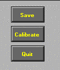
Otherwise, they should be large enough to comfortably accomodate the longest text that one contains. Remember to test this with the display set to LARGE fonts, as the button size will automatically grow if necessary, to accomodate the text. If the size is set on SMALL fonts, and if some buttons have text that is approaching the edges, and then shown on LARGE fonts, the buttons do not grow equally:
This VI looks OK....
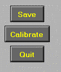
Until you look at it with LARGE fonts:
The text of a button in the depressed state should be the same as that in the normal state plus a space and a question mark. In other words, if the button normally says "Quit", the depressed text should be "Quit ?". This indicates to the user that there is still an option to back out of the operation.
The mechanical action of a button should be set to LATCH WHEN RELEASED. This gives the user the chance to back out after clicking the button, if they release the mouse button somewhere other than in the button frame.
If an event structure is used, make sure to read the button terminal itself, and not just the event's NEW VALUE, within the VALUE CHANGED event case. Reading the button's terminal is what causes the button to automatically return to the non-depressed state.