Culverson - Elegant software that is a pleasure to use

LabVIEW

Style Guide


This LabVIEW Style Guide is intended as a statement of values that define Culverson's approach to the software our customers get.

Object Labels

  Test your panels on both small fonts and large fonts (Control Panels - Display - Properties - Settings - Advanced). This is the biggest deficiency of a lot of software in the Windows world. Even N.I. software is guilty of not paying attention to this. If you have two computers on a network, you can set up one computer to use small fonts and the other to use large fonts, share the program, and run it on each. Or you can switch on a single computer (quit LabView, make the switch, relaunch LabVIEW - you do NOT need to restart Windows, in spite of the warning).

  To make a single front panel work on both sizes, it is necessary to follow several rules:

  1. "Size To Text" is a problematic attribute. By default, all panel objects' labels have it ON. Do not leave it ON. Ever. On anything. If you've mangled the display rectangle for an object's label, turn it ON and then back OFF to get a new starting point, but never leave it ON.
  2. It is easier to work in Large fonts, and test in small, than vice versa.
  3. Labels displayed to the left of an input field should be RIGHT justified. Labels displayed to the right of an input field should be LEFT justified. Labels displayed above in input field should be stretched to the width of the field, and CENTER justified.
  4. The text baseline of the label itself (not counting descenders on letters like "g" or "y") should line up vertically with the baseline of the number or string inside the field. The ONLY way this works for both LARGE and SMALL fonts is for SIZE TO TEXT to be OFF. Consider the following:
    [OrigLargeShowLarge.png 
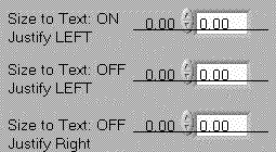
Created with large fonts, shown with large fonts.
      Three numerical controls were created, with the label aligned to the numeric text, identical except for the label's attributes, as shown.
      The horizontal line is just to show alignment.
      The VI was saved.
    [OrigLargeShowSmall.png 
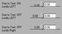
Created with large fonts, shown with small fonts.
      Opening the above VI with the display set to small fonts, you can see the mis-alignment that occurs. The numeric box has shrunk (as expected), and the text within has been moved upward (because of decreased vertical space in the smaller font), while the label has actually moved DOWN (relative to the line).
      The center object shows that turning off the SIZE TO TEXT attribute leaves the label vertically aligned correctly, but horizontally, it's now too far away from the control.
      The bottom object shows the correct combination. The fact that the label's rectangle does not shrink is immaterial.
    [OrigSmallShowSmall.png 
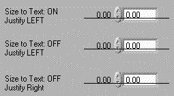
Created with small fonts, shown with small fonts.
      Here we do the same thing, except we start with small fonts.
    [OrigSmallShowLarge.png 
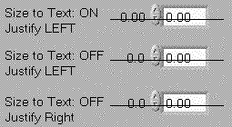
Created with small fonts, shown with large fonts.
      This shows the problem with working in small fonts and testing in large - since we have turned OFF the SIZE TO TEXT attribute, the label's rectangle does not grow, thus text is cut off (part of the label is missing).
      You could work around this by stretching each rectangle before saving, but that's an extra step.
  5. Make sure that there are no overlapping objects or object labels. This also is easier to do when working in large fonts.

Return to Index